


Interactive Infographics - A New Way To ‘Play’ With Data
In a time where the Internet is saturated with blogs and content, a reader needs something different from the norm to encourage them to read further and process the information. Sort of like revision flash cards, for the adult reader.
And this is where infographics come in. An infographic traditionally breaks down content and presents it in imagery to ensure that it is more manageable to read and easier to remember.

Interactive [ɪntəræktɪv] adj. 1) (Electronics & Computer Science / Computer Science) allowing or relating to continuous two-way transfer of information between a user and the central point of a communication system, such as a computer or television 2) (Of two or more persons, forces, etc.) acting upon or in close relation with each other; interacting
An interactive infographic takes this one step further, allowing the reader to click on parts of the image and expand the information selection.
So why an interactive infographic?
- More comprehensible for the reader.
- Easier to update and add layers with changing trends.
- Involves users.
- Involvement can be personalized or localised.
A fantastic example of an interactive infographic can be found at the New York Times, where they put together stats for people to understand the average home in the United States. You can select the amount of people in your family and it will give you information on the average living costs, break down of wages and other factors.

Visit http://www.nytimes.com/interactive/2011/06/19/nyregion/how-many-households-are-like-yours.html
Another great example is the clean water access infographic, developed in conjunction with Levis, which details the need for fresh water in the developing world and how it will affect different age groups.
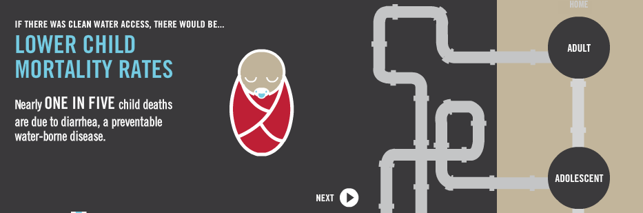
Visit: http://awesome.good.is/transparency/web/1109/water-access/flash.html
How can interactive infographics boost your business?
It’s all about the social implications. If you present information to people in an easy and readable way that they understand then they are more likely to share it on sites like Facebook and Twitter, driving more traffic back to your site. The better your information looks, the more interesting it is to the consumer, and in a time when Google are announcing the implications of social influence within search results, it could boost you that bit higher in the search engine results. In a world where an image speaks 1000 words, an interactive inographic is far more appealing to the customer.
